Once you have created a persuasive ad or email copy and the viewer clicks the link to buy your product, or sign up for your service, they are redirected to a page where they are transformed into a customer or client or at the least, a lead. The sole purpose of a landing page is conversion.
To create a landing page that converts, begin by defining your goal. The goal of your landing page not only determines what your call-to-action (CTA) would be; it runs deeper. It determines everything about the landing page from the design to the contents. There are many reasons a landing page exists, such as
- Growing your email list
- Purchasing your product
- Registering for a program
- Accessing a free trial, etc.
There are two major aspects that this article focuses on the content and the web design. The content is the persuasive message that gets turns the prospect into a lead. The design is the container that strengthens your points through visual appeal. There are also examples of real landing pages that illustrate every point.
-
THE CONTENT
Craft the Perfect Headline
Many people over-focus on creating the catchiest headline while deviating from the purpose of the product or service. Search Engine Optimization experts at VFMSEO states that “the perfect headline is not just the one that grabs attention the most; it is also the one that summarizes what you are offering in as few words as necessary.”
Consider Shopify’s landing page below. From the headline, anyone can tell what’s up.

Explain your Product/Service
To explain your product or service, you need to include some more text.
- Highlight the benefits, not just the features. That is, don’t only state what’s interesting about your offering, explain what’s in it for the visitors. Explain how the product or offering would help THEM.
- The length of the body copy is a tricky aspect. You don’t want to say too little that the prospect does not understand you. Yet, you don’t want to say too much to avoid overwhelming the prospect and making them lose interest. There is no ideal word count. Use as many words as are enough to make your point and no more.
- In crafting the copy for your landing page, anticipate possible and concerns objections and address them
The image below is from Deezer’s landing page and it illustrates all the points stated above. It highlights the benefit of the app for ‘you’ (the prospect), it neither says too much nor too little, and it identifies and addresses a possible concern (‘No WiFi? No problem). Perfect.

Make the Prospect Trust You
This is very important, especially if you are a small startup with limited publicity. Social proofs such as testimonials, badges, certifications, expert quotes, press releases, etc. show two things: expertise and credibility. The testimonials and quotes buy klonopin no prescription online should not be essay-long; they should be concise statements that highlight a specific aspect of how your product or service was useful to a customer. Likewise, trust elements should be relevant.
Below is a screenshot from AVG’s landing page displaying certification badges to prove their credibility as a cybersecurity platform.

-
THE DESIGN
Images and Videos Reinforce your Message
Images and videos add a visual appeal to your message, but even more, they pique the visitor’s interest. It is no longer news that human beings process images several times faster than text. That implies that, by not adding images to your landing page, you denying yourself the full range of opportunities available to you.
- The image may only display the product or add explanatory details, show how to use your product or service, or just be a visual branding element. The most important aspect of this is that it must be relevant to your offering.
- It should be a persuasive image, not just some stock picture. Remember that you are making an impression, and if it is short of great, then it should be discarded.
- Videos on a landing page can boost conversions by up to 86%! Videos, though not compulsory, are powerful because they allow you to explain the product or service in detail that you can’t with text because it would become so long and be cluttering.
Take a cue from the image below, a screenshot of Pushbullet’s landing page and see how the image corroborates the key message, ‘…connects your devices…’

Keep Things Simple
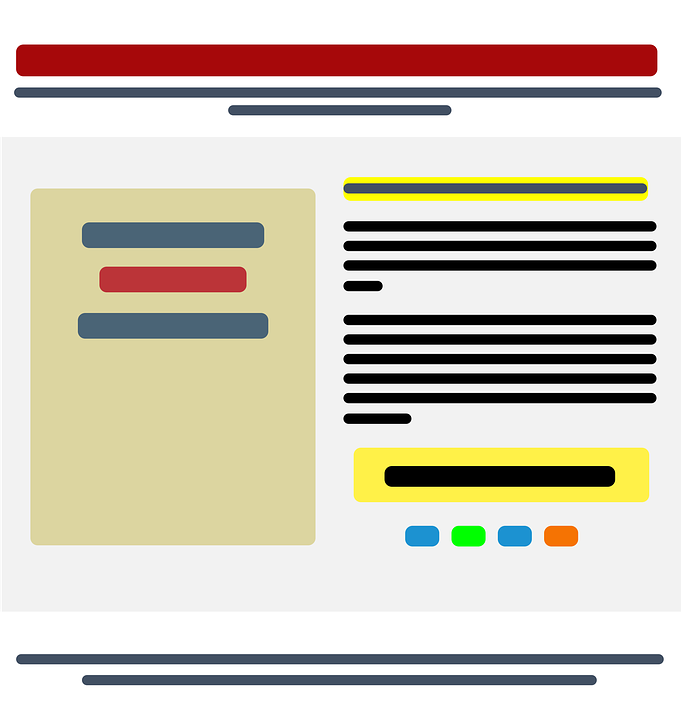
As mentioned above, the sole purpose of a landing page is conversion. Thus, every element on the page must be towards achieving that. To get the viewer to take the required action, strip away every unnecessary element. It is not advisable to make your homepage double as a landing page, though it could. Why? The homepage is usually cluttered with too much information, links, buttons, etc. that could distract the visitor. And if your home page must also be your landing page, then it must be stripped of unnecessary elements. The picture below is what Netflix’s homepage, which is also a landing page, looks like:

Conclusion
It is easy to write a landing page if you don’t about converting. A killer landing page is a product of clever strategy and careful planning. If there are any two important points you should take away from this article, here are they:
- There is no one-size-fits-all approach to create landing pages. Make decisions that sell YOUR brand and craft a message that speaks to YOUR audience.
- Creating a landing page is not a once-and-for-all action. You have to constantly analyze your landing page(s), measuring performance against different metrics, and making adjustments where necessary.